- Print
Shortform view
- Print
Add Library
Add the code below to build.gradle. Add combined or split packaging library to app/build.gradle
Combined Packaging Library
Split Packaging Library
Apply AccessKey
Access Key
Access key and secret key can be obtained from the Shoplive representative (ask@shoplive.cloud).
Apply Native List View
Apply the desired Shortform list view.
ShopLiveShortformCardTypeView
For Vertical Scroll Layout (Large Content Grid), add ShopLiveShortformCardTypeView to the XML for the large content grid list screen with the following configuration.
ShopLiveShortformVerticalTypeView
For Vertical Scroll Layout (Small Content Grid), add the ShopLiveShortformVerticalTypeView to the XML for the small content grid list screen with the following configuration.
ShopLiveShortformHorizontalTypeView
For Horizontal Scroll Layout, add the ShopLiveShortformHorizontalTypeView to the XML for the horizontal scroll list screen with the following configuration.
ShopLiveShortformDetailTypeView
Configure the detailed screen collection on the screen to be exposed as follows. Client's ShopLiveShortformDetailTypeView XML Add the
<cloud.shoplive.sdk.shorts.ShopLiveShortformDetailTypeView
    android:id="@+id/shortsDetailTypeView"
    android:layout_width="match_parent"
    android:layout_height="match_parent" />
View settings
View activation
Activate the view using a builder and load the data by invoking submit() function. (If submit() function is not called, the data will not be loaded, and the list view will not be configured on the screen.)
yourView.submit()Card View type configuration
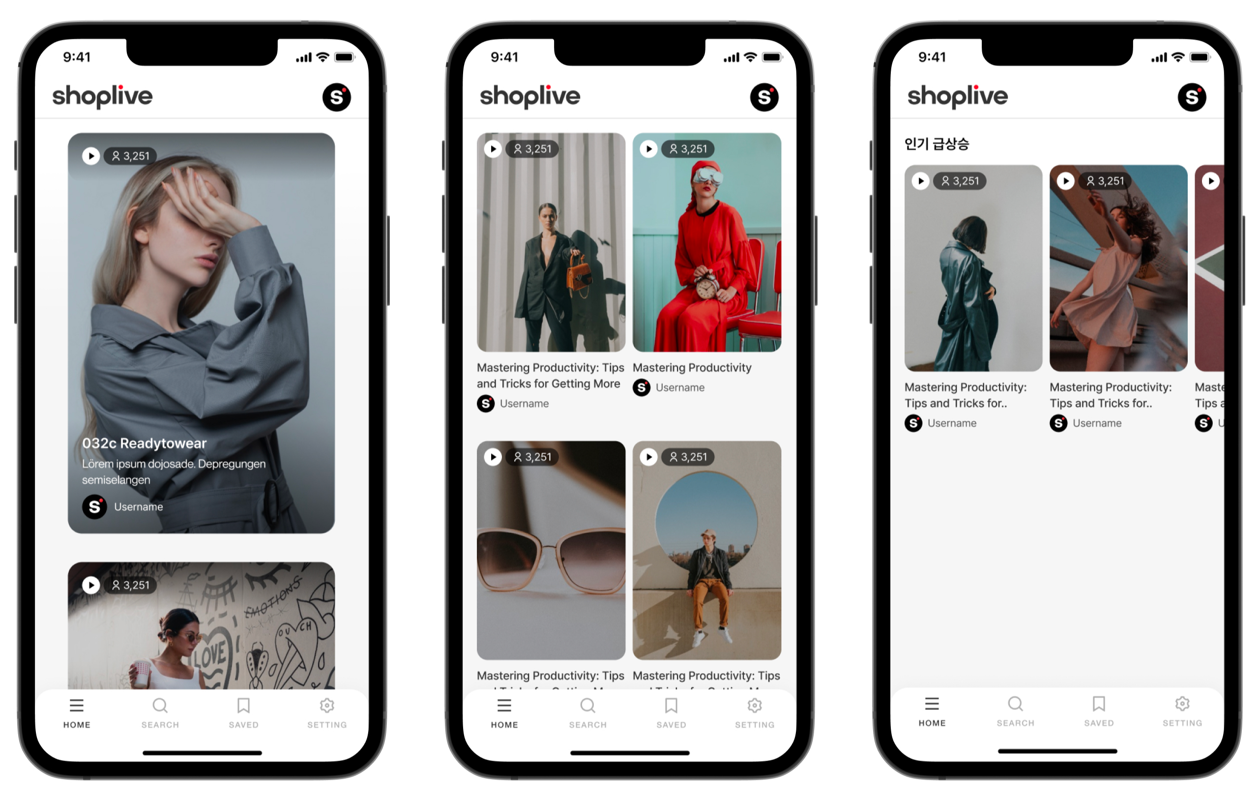
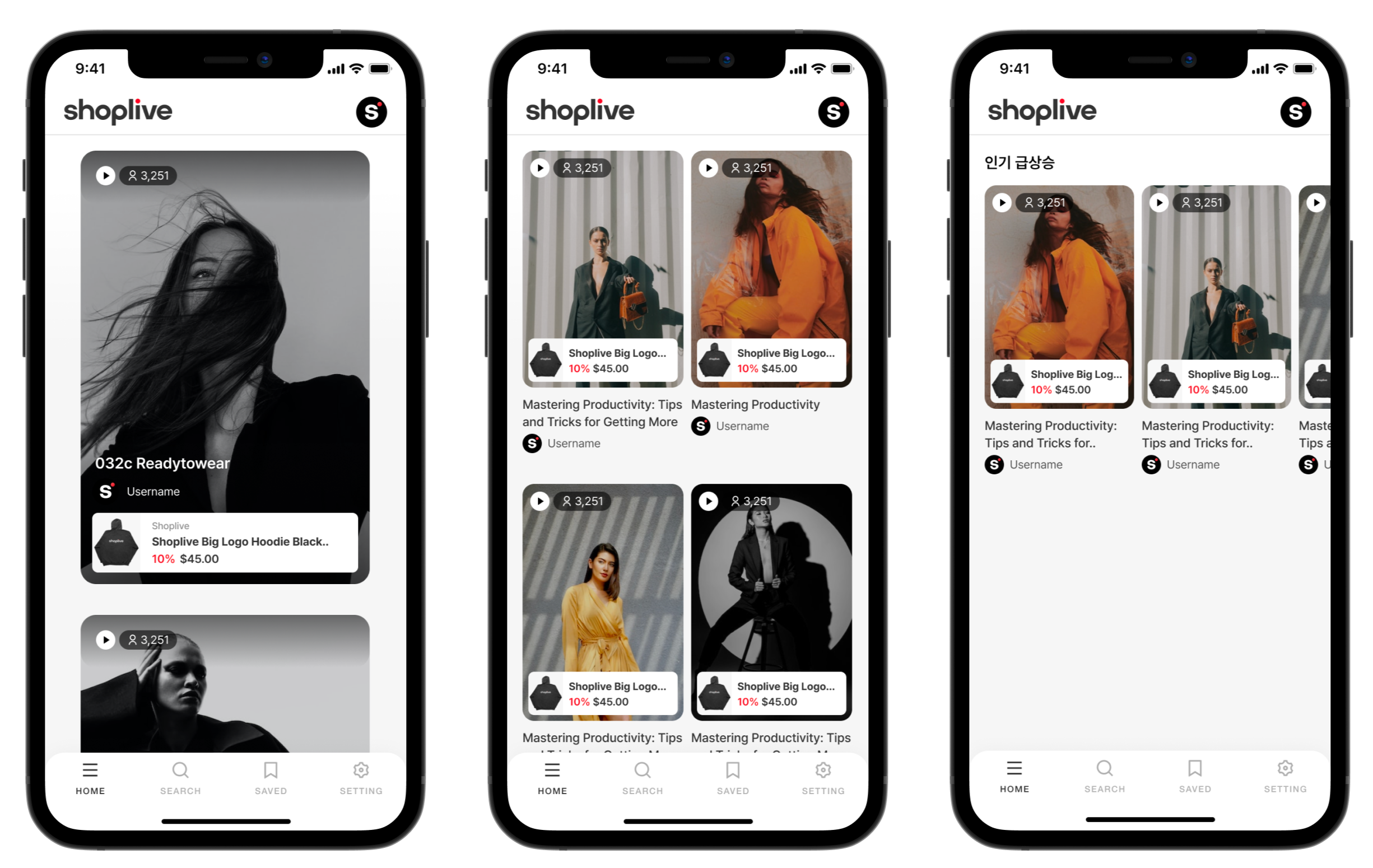
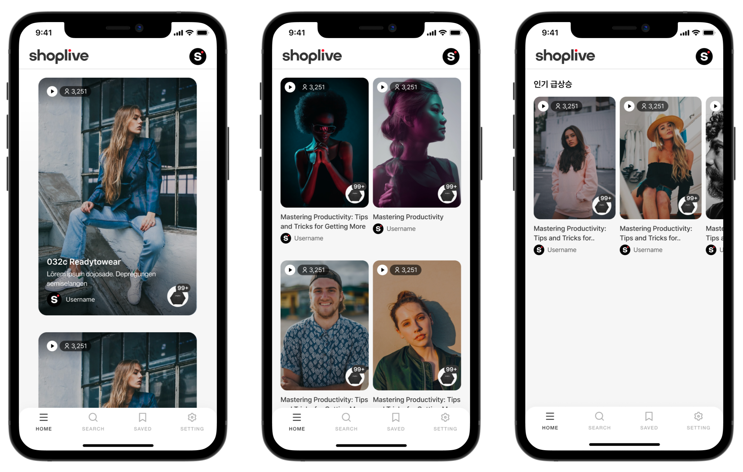
Configure card-type layout (Default: CARD_TYPE1)
.CARD_TYPE0: No product card on the collection view.CARD_TYPE1: Square product card on the collection view.CARD_TYPE2: Circle product card on the collection view
// CARD_TYPE0, CARD_TYPE1, CARD_TYPE2
yourView.setViewType(type: ShopLiveShortform.CardViewType)
Refer to the following example
CARD_TYPE0

CARD_TYPE1

CARD_TYPE2

Tag-Based Collection View
You can search by HashTag
ShopLiveShortformTagSearchOperator.OR: HashTag unified search (Default)ShopLiveShortformTagSearchOperator.AND: HashTag cross-search
yourView.setHashTags(hashTags: List<String>?, tagSearchOperator: ShopLiveShortformTagSearchOperator)Brand-Based Collection View
You can search by brand (either brand name or identifier)
yourView.setBrands(brands: List<String>?)Shuffled Collection View
Display data in random order or by most recent time.
enableShuffle(): Display random datadisableShuffle(): Display data by most recent time
yourView.enableShuffle()
yourView.disableShuffle()
Enable Snap effect
Use snap effects to highlight individual content.
enableSnap(): Enable snap effectdisableSnap(): Disable snap effect (Default)
yourView.enableSnap()
yourView.disableSnap()
Shortform playback range (Horizontal Layout Only)
You can select which cells to render in the horizontal scroll.
PlayableType.First: Only the leftmost cell in the visible area is rendered. (Default)PlayableType.Center: Only the center cell in the visible area is rendered.PlayableType.All: Entire cell in the visible area is rendered.
yourView.setPlayableType(type: ShopLiveShortform.PlayableType)Configure video autoplay effects
Configure whether to autoplay videos in cells.
enablePlayVideos(): Enable autoplay videos in cells. (Default)disablePlayVideos(): Disable autoplay videos in cells. (Advanced: In a Pager structure, when moving between tabs, you can release memory by calling.)disablePlayVideos()on the view that was playing videos. When returning to the same tab, callingenablePlayVideos()on the view again allows you to manage memory in the client's app
yourView.enablePlayVideos()
yourView.disablePlayVideos()
Scroll to the top
Go to the top of the page.
yourView.scrollToTop()Set videos to play only on Wi-Fi
Configure video playback to occur only when connected to Wi-Fi
true: Playback only when connected to Wi-Fifalse: Playback on any network (Default)
yourView.setPlayOnlyWifi(isEnabled : Boolean)Set item spacing
Customize the spacing between ViewHolders. The default spacing is set by default.
ShopLiveShortformCardTypeViewtop: 32dp, bottom: 32 dp, left: 32dp, right: 32dp
ShopLiveShortformVerticalTypeViewtop: 16dp, bottom: 16dp, left: 16dp, right: 16dp
Spacing between ViewHolder: 8dp
ShopLiveShortformHorizontalTypeViewtop: 16dp, bottom: 16dp, left: 16dp, right: 16dp
Spacing between ViewHolder: 8dp
yourView.addItemDecoration(object : ItemDecoration() {
	override fun getItemOffsets(
		outRect: Rect,
		view: View,
		parent: RecyclerView,
		state: RecyclerView.State
	) {
    super.getItemOffsets(outRect, view, parent, state)
    parent.getChildAdapterPosition(view)
    val itemCount = parent.adapter?.itemCount ?: 0
    if (parent.getChildAdapterPosition(view) == 0) {
        outRect.top = 16.toDp(view.context).toInt()
        outRect.bottom = 16.toDp(view.context).toInt()
        outRect.left = 16.toDp(view.context).toInt()
        outRect.right = 4.toDp(view.context).toInt()
    } else if (parent.getChildAdapterPosition(view) == itemCount - 1) {
        outRect.top = 16.toDp(view.context).toInt()
        outRect.bottom = 16.toDp(view.context).toInt()
        outRect.left = 4.toDp(view.context).toInt()
        outRect.right = 16.toDp(view.context).toInt()
    } else {
        outRect.top = 16.toDp(view.context).toInt()
        outRect.bottom = 16.toDp(view.context).toInt()
        outRect.left = 4.toDp(view.context).toInt()
        outRect.right = 4.toDp(view.context).toInt()
    }
	}
})

fun Int.toDp(context: Context): Float = TypedValue.applyDimension(
    TypedValue.COMPLEX_UNIT_DIP,
    this.toFloat(),
    context.resources.displayMetrics
)
Hide View Count
Hide the view indicating the number of views (Default: visible).
yourView.setVisibleViewCount(isVisible : Boolean)Hide Product Count
Hide the view indicating the number of products (Default: visible).
yourView.setVisibleProductCount(isVisible : Boolean)Hide Brand
Hide the brand view (Default: visible).
yourView.setVisibleBrand(isVisible : Boolean)Hide Title
Hide title (Default: visible).
yourView.setVisibleTitle(isVisible : Boolean)Hide the Description
Hide the description (Default: visible).
yourView.setVisibleDescription(isVisible : Boolean)Set the Corner Radius
Configure the cornerRadius of content (Default:6px)
ShopLiveShortformCardTypeView: 16dpShopLiveShortformVerticalTypeView: 12dpShopLiveShortformHorizontalTypeView: 12dp
yourView.setRadius(radius : Float)Placeholder Color Setting
Configure the default value for placeholders (Default: CBCBCB).
yourView.setCardBackgroundColor(@ColorInt colorInt: Int)Add entry path statistics
Adding parameters to measure entry path statistics.
yourView.setReferrer(referrer : String?)Handler settings
Scroll Control
ShopLiveShortform.setHandler(object : ShopLiveShortformHandler() {
	override fun getOnClickProductListener(): ShopLiveShortformProductListener {
	    return ShopLiveShortformProductListener { context, data, product ->
	        // Something landing customer
    	}
	}

	override fun getOnClickBannerListener(): ShopLiveShortformUrlListener {
    	return ShopLiveShortformUrlListener { context, data, url ->
        	// Something landing customer
	    }
	}

	override fun onEvent(context: Context, webView: ShopLiveShortformWebView?, command: String, payload: String?) {
		// Do something
	}

	override fun onError(context: Context, error: ShopLiveCommonError) {
		// Do something
	}

	override fun onShare(context: Context, data: ShopLiveShortformShareData) {
		// Do something
	}

	override fun onCreate() {
		// Do something
	}

	override fun onDestroy() {
		// Do something
	}

    open fun onShortsAttached(data: ShopLiveShortformData) {
        // Do nothing
    }

    open fun onShortsDetached(data: ShopLiveShortformData) {
        // Do nothing
    }
}).png)
